4 examples of awesome emails (and why they’re awesome)
Every month, over one billion digital messages are sent in the GovDelivery Communications Cloud from government organisations across the UK, US and Europe. With so many digital messages pinging to and from inboxes, it can be challenging to recall specific characteristics of an effective email message.
That’s why we created “10 Excellent Emails” — a guide that highlights examples of effective digital messages from government organisations in the UK public sector.
Here are four more stellar email examples we hope will help inspire your work to better connect with your audience. Designed in the GovDelivery Communications Cloud’s Advanced Bulletin Editor (ABE), these examples are created with an intuitive interface and make for sleek, professional-looking bulletins that command recipients’ attention and prompt clicks and action.
1. Bournemouth Borough Council

Why it’s awesome:
- Attractive hero banner: A hero image is a large banner image prominently placed in an e-newsletter, generally in the front and centre, used to attract attention and frame the message.
- Clear, condensed message: In addition to imagery, an organised and straightforward message can make all the difference for click rates. This message proves that a strong message in an e-newsletter can contain less than 60 words. Set yourself character limits to avoid an imbalance of text:image – balanced text and images with section dividers are pleasing on the eye and easy to assimilate.
- Straight, consistent formatting: This clean and uncluttered template helps direct readers quickly scan the headlines and key messages.
2. Oklahoma Department of Emergency Management

Why it’s awesome:
- Vibrant colours: In addition to strong imagery, vibrant colors can make a digital message dynamic and interesting.
- Large, obvious icons: This message uses icons effectively with strong placement and sizing. The icons quickly tell the reader what the content is going to be about.
- Alternating background colour: Changing up colours in message sections is a great way to organise content and allows the reader to consume content in small, easy-to-manage chunks.
3. City of New Orleans Neighborhood Engagement Office
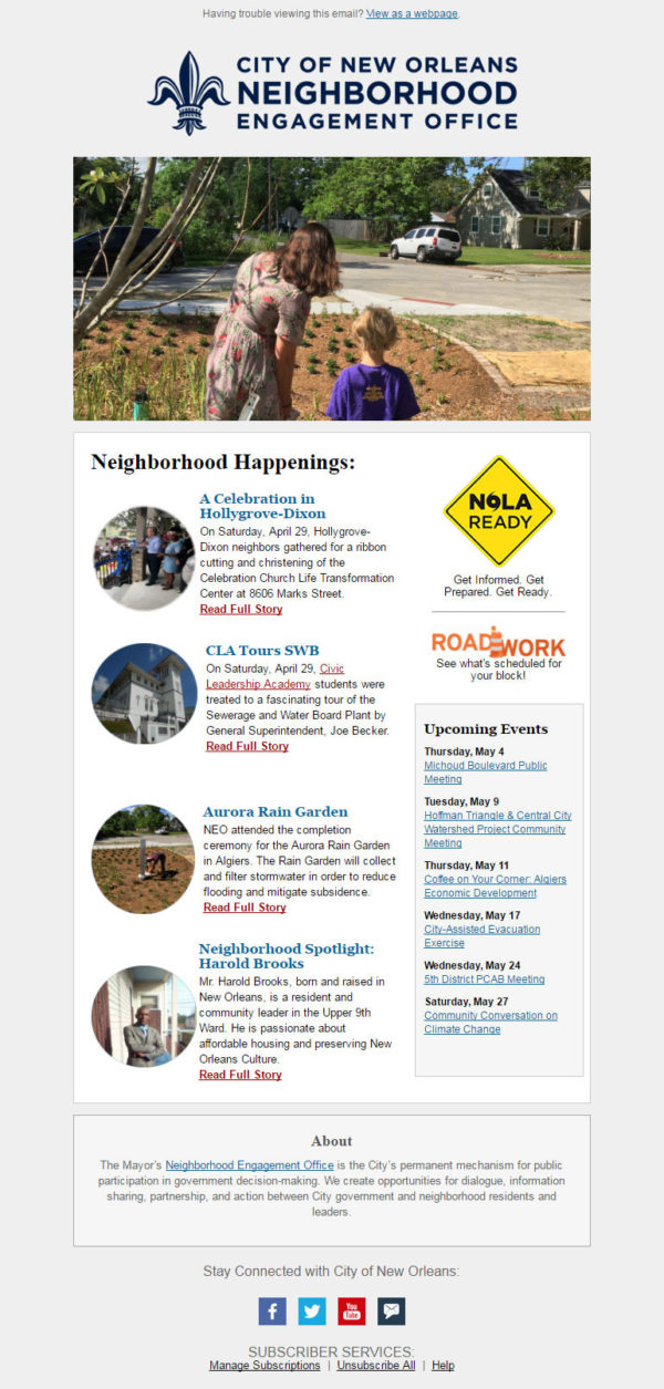
Why it’s awesome:
- Creative use of imagery: This organisation’s use of circular images offers a stylish alternative to typical rectangular images. The large, visible hero banner presents a strong overview of the content of the email.
- Effective sidebar: This example has a small, interesting sidebar for useful and important content. A sidebar will take the readers’ eyes away from the main content, so if you use one, make sure it has content that you want all of your readers to understand and take action on. For example, a sidebar is not a good place to put your phone number or address. Those things should be in your footer, which is the anchor of the email — this is where your readers will naturally look for your contact information.
4. City of Minnetonka
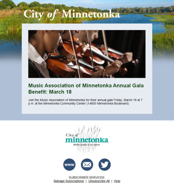
Why it’s awesome:
- Strong background image: Background images are not supported by all email clients, but you achieve the same look by creatively setting up your content. In this example, the “background image” was cut into pieces and placed into containers.
- Simple messaging: This design does a great job of using a small amount of content to deliver a meaningful message. If you have a web page where content lives, you don’t need to rewrite the entire story in the email. Instead, show an attractive image and a quick, succinct heading and blurb to drive readers to check out the full story if they are interested.
Looking for more awesome email examples? Download “10 Excellent Emails” for more inspiration when creating your next message.